
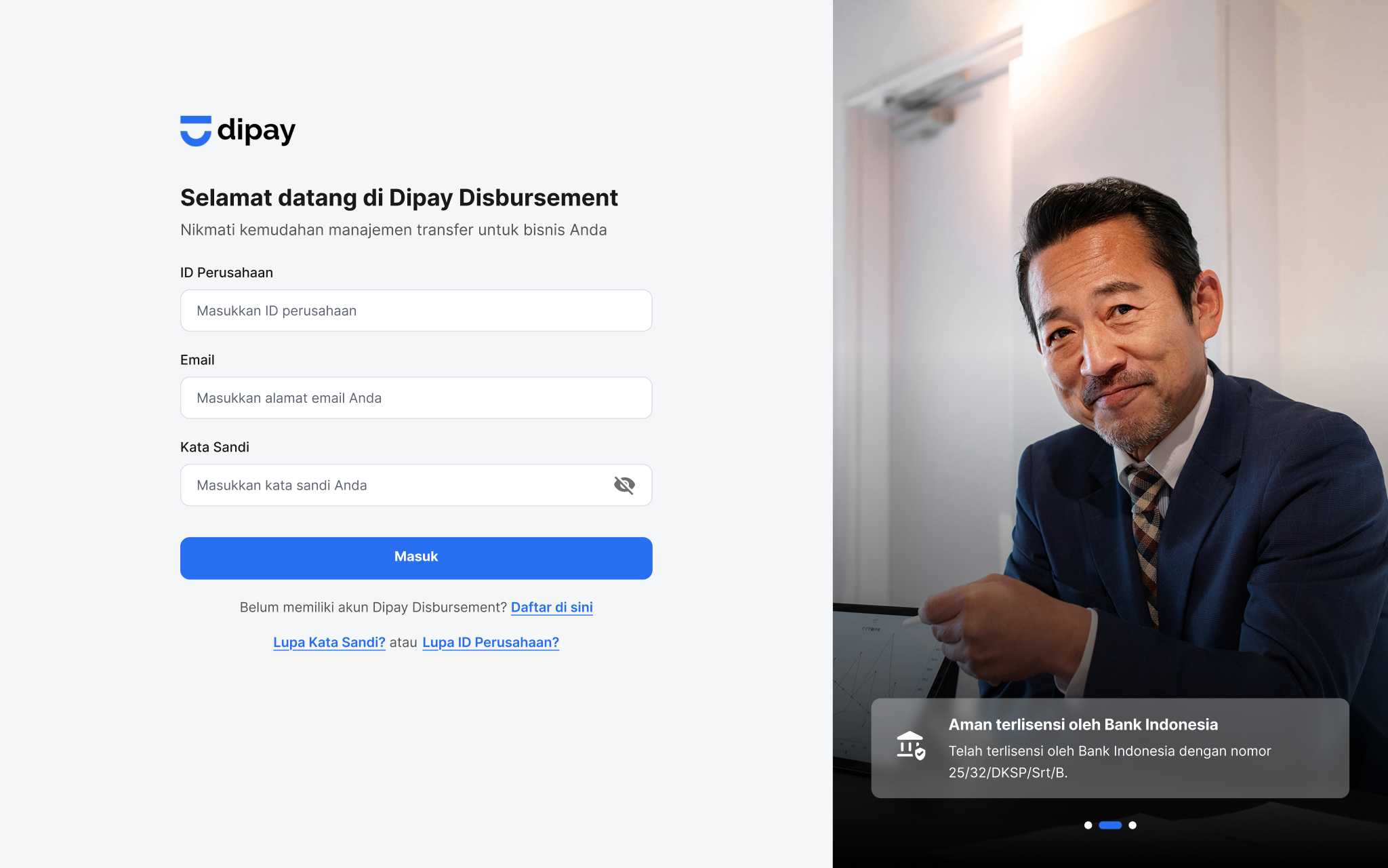
enterprise.dipay.id
LiveCaseWeb | Fintech
Surya Fajar Capital

I led the redesign of SF Capital's corporate website, transforming it from a static placeholder into a unified, responsive, and investor-ready presence. The revamp was initiated as SF Capital (Surya Fajar Capital) entered a new phase as a publicly listed company (IDX: SFAN). We restructured the site to reflect its role as a holding company, clarified the relationship between subsidiaries, and introduced a full-featured Investor Relations (IR) section that meets public company disclosure standards.
When SF Capital became a publicly listed company, the expectations around its digital presence shifted dramatically. The old site had only a few basic pages and was built as a compliance formality, offering little context about the group's structure, business units, or long-term vision.
This was problematic for both investors and partners. Institutional investors needed timely and transparent access to financial reports. Retail visitors were often confused about the company's relationship with subsidiaries like SF Sekuritas or SFUND. And prospective partners lacked a clear picture of what SF Capital actually does.
A modern, responsive website that clearly introduces SF Capital as a multi-entity financial group, while also providing the trust signals required by public company stakeholders.
Corporate Overview → a section that introduces SF Capital's role as a holding company, along with its investment philosophy, governance structure, and long-term goals.
Subsidiary Navigator → a modular layout that visually clarifies the different companies under the SF Capital group, including SF Sekuritas, SFUND, and SF Ventures.
Investor Relations (IR) → a structured space for IDX filings, financial reports, and investor disclosures, making it easy for stakeholders to find verified updates.
To build investor trust and business credibility by presenting SF Capital as a serious, transparent, and strategically structured public company, not just through words, but through clear architecture and thoughtful interaction design.

Old SF Capital Website Design
I worked directly with the Director and Corporate Secretary to understand regulatory expectations, business goals, and how investors typically consume IR content. Since this was a high-urgency project tied to the IPO timeline, most iterations happened in real-time over working sessions.
This wasn't just a UI facelift, it required thinking about how to represent a growing financial ecosystem under one coherent brand voice.
Understand what SF Capital actually does → By redesigning the homepage and corporate section, users can quickly grasp that SF Capital is a holding company with diverse subsidiaries in financial services.
Find relevant information about subsidiaries → A visual navigator helps users explore different entities like SF Sekuritas, SFUND, and SF Ventures without leaving the main site or getting confused about ownership.
Access verified financial reports and IDX filings → Through a dedicated Investor Relations (IR) section, public investors and analysts can download quarterly reports, prospectuses, and other key filings easily.
Present SF Capital as a credible, listed financial group → The new site introduces SF Capital with clear, professional messaging that reflects the company's maturity and strategic direction.
Support investor confidence and compliance → The IR section ensures that the company meets OJK/IDX transparency standards, while also giving investors a reason to trust the brand beyond minimum compliance.
Clarify holding structure across all subsidiaries → Rather than treat each entity in isolation, the website visually positions subsidiaries as part of one strategic group, supporting cross-brand recognition and synergy.
Build a modern, mobile-friendly presence → The new design uses a fluid layout that ensures easy reading and navigation across all devices, including phones and tablets.
With goals aligned, I benchmarked other platforms like Saratoga and Northstar to gather answers to specific questions:

Benchmarking from Saratoga website

Benchmarking from Northstar website
How do listed holding companies structure their websites? → Many firms like Northstar and Saratoga use a split homepage that separates their corporate narrative from their investment portfolio. This helped us rethink SF Capital's layout into two flows: one that tells the company story, and one that shows the business ecosystem.
How is investor information typically surfaced? → Saratoga's IR section is structured chronologically, with downloadable PDFs, charts, and key metrics surfaced up front. Northstar uses a minimalist approach but lacks file clarity. SF Capital's IR page adopted the best of both: clarity in document categories and ease of access.
How should subsidiaries be represented? → Most holding companies either list all subsidiaries in text or separate them completely. SF Capital takes a visual module approach, grouping subsidiaries with logos, descriptions, and CTA links, all within the parent site.

Feature Aspect Table
The homepage introduces SF Capital as a holding company, with two main entry points: an overview of the company's role, and a gateway into its business ecosystem.

New SF Capital Homepage
This section shows the main subsidiaries under SF Capital: SF Sekuritas, Dipay, etc. Each is presented as part of a cohesive group, while linking out to their respective sites.

New Portfolio Section
The IR section includes quarterly and annual reports, IDX disclosures, and shareholder information, organized by type and chronology for maximum accessibility.

New IR page
Every section was designed using a 12-column fluid grid to support all breakpoints, with mobile-first behavior especially for key investor actions.

Responsive views homepage, portfolio & IR section
To ensure visual consistency and enable scalable growth, I introduced a lightweight design system for SF Capital's web.
It covered:

Design System Preview
This system now acts as a visual backbone, helping the brand remain consistent across future updates, disclosures, or product expansions.
This project taught me that designing for corporate credibility requires more than just clean visuals, it's about signaling maturity and structure through architecture, tone, and hierarchy.
I learned to:
By translating complexity into clarity, the new SF Capital website now reflects the ambition and accountability of a public financial group and gives users a clear reason to trust what they see.
Selected products I've designed, from launched platforms to ongoing builds.
Web | Fintech
Mobile | Fintech